Poutyface Paints Outside the Lines with “Color”: A Raw, Emotional Portrait of Chaos, Craving, and Connection
Content note: This article discusses emotional distress, self-criticism, isolation and the craving to feel real. The analysis is interpretive and focuses on the speaker within the song rather than treating the lyrics as autobiography.
Poutyface’s “Color” sounds bright enough to bruise your retinas. It is bouncy, sharp-edged, playful, a little frantic, and full of images that seem sweet until they start chewing through the furniture. On the surface, it is a song about someone who brings colour back into life. A person, a feeling, a crush, an attachment, a rescue flare in human form.
But the song is doing more than saying “you make me happy.” It is about the hunger to feel vivid. To be pulled out of grey emotional weather. To be seen in full saturation rather than reduced to something soft, manageable and easy to misunderstand.
That is where “Color” becomes psychologically interesting. Its central metaphor works in several directions at once. Colour is affection. Colour is emotional intensity. Colour is identity. Colour is Pride. Colour is the opposite of being flattened into black and white by shame, depression, boredom, social pressure, or someone else’s cramped little idea of who you are allowed to be.
It is a pop song with a panic-attack heart. Glitter on the outside, teeth marks in the plastic underneath.
Colour as Emotional Aliveness
The refrain, “You give me color,” sounds simple, which is part of its strength. It has the directness of a love song, but the desperation of something closer to psychological resuscitation. The speaker is not merely saying that another person makes life nicer. They seem to be saying this person, feeling, or attachment makes life perceptible again.
Colour here becomes a sign of aliveness. Without it, the world feels flat. With it, there is contrast, brightness, affection, drama, magic. The speaker wants to feel lit up, not in the calm wellness-poster sense, but in the slightly alarming sense of someone who has spent too long emotionally underexposed.
This gives the song a useful double edge. On one hand, it captures the beauty of connection. Some people do bring colour into our lives. They make the world feel less deadened. They remind us that we have a body, a pulse, a ridiculous little heart that keeps insisting on being involved.
On the other hand, there is an ache in depending on someone else for that colour. If one person becomes the source of emotional brightness, then their absence can make the world feel unliveable again. The song seems aware of that danger. Its joy is never entirely stable. The brightness is wanted, but it is wanted with the urgency of someone who knows what the dark feels like.
Pride and the Refusal of Black-and-White Life
The missed Pride angle is right there in the song’s own language. “Done with the black and white / Make it all chromatic” is not only an emotional line. It also invites a Pride-inflected reading.
That does not mean the song has to be treated as a direct Pride anthem or a definitive statement of queer identity. A better reading is that “Color” speaks beautifully to one of Pride’s central psychological themes: the refusal to live in grayscale because someone else finds that easier to process.
Colour, in Pride contexts, is not just decoration. It is visibility. It is insistence. It is the refusal of shame, hiding and social dulling. It says that identity is not meant to be flattened into the safest available category. It says the self can be multiple, bright, contradictory, playful, wounded, erotic, awkward, loud, soft, and still real.
That sits neatly alongside the song’s resistance to black-and-white life. Black-and-white thinking is rigid. It divides the world into clean categories: good or bad, normal or strange, acceptable or too much. But people are not clean categories, despite several centuries of bureaucracy trying its best.
“Color” pushes back against that. To make life chromatic is to allow mixture. It is to accept that a person can be sweet and furious, soft and chaotic, needy and generous, frightened and bold. It is also to reject the emotional beige that often gets mistaken for maturity.
From a Pride angle, the song becomes not just a plea for affection, but a demand for fullness. The speaker does not want to be tolerated in outline. They want brightness, saturation, expression. They want life in colour, not the socially approved pencil sketch.
Soft, Sweet, and Secretly Twisted Up
One of the song’s sharpest tensions comes from the gap between how the speaker is seen and how they feel inside. Other people apparently read them as “soft and sweet,” but the speaker’s inner world is far less tidy. They feel twisted up, overwhelmed, restless, and difficult to hold still.
This is a familiar psychological split. Many people become very good at presenting the version of themselves that others find easiest to love. Soft. Funny. Helpful. Bright. Low-maintenance. Slightly quirky, but not in a way that causes admin. Meanwhile, underneath, there may be panic, anger, need, resentment, confusion, or the quiet sense that nobody is seeing the actual person, only the export-friendly version.
“Color” captures that friction without over-explaining it. The speaker’s public image is sweet, but the private experience is tangled. That makes the song feel less like a straightforward celebration of colour and more like a question: what happens when the colourful self is both real and performed?
Because colour can be a mask too. A person can look vivid while feeling hollow. They can be expressive while feeling unseen. They can make other people laugh while quietly becoming a weather event with shoes on. Brightness is not always proof of ease. Sometimes it is camouflage. Sometimes it is a survival strategy with better styling.
The song leaves room for that complication. Its colour is not shallow cheerfulness. It is unstable, emotional, bodily and slightly dangerous. Good. Cheerfulness is often overrated by people who have never had to use it defensively.
Bruising, Brightness, and the Body
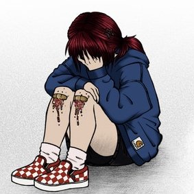
“Color” keeps returning to the body: red cheeks, a blue heart, easy bruising, skinned knees, teeth, static, twisting. These images make emotion physical. Feeling is not treated as something floating politely in the mind. It shows up in skin, posture, pressure, impulse and sensation.
That physicality gives the song much of its force. The speaker does not simply feel vulnerable. They bruise easily. They do not simply feel restless. They tear into things. They do not simply feel confused. They are twisted up like fabric dyed into brightness.
The colour imagery also complicates itself here. Red cheeks might suggest embarrassment, attraction, effort or exposure. A blue heart suggests sadness, coldness, ache. Bruising introduces colour as injury. The body becomes a palette, but not all the colours are joyful. Some are evidence.
This is one of the reasons the Pride reading should not be reduced to rainbow optimism. Colour in this song is not just celebration. It includes pain, sensitivity and the marks left by contact with the world. Visibility can be liberating, but it can also make people easier to wound. To be seen is not automatically to be safe.
That tension gives “Color” its emotional honesty. The speaker wants brightness, but brightness involves exposure. They want affection, but affection means vulnerability. They want to feel alive, but aliveness comes with impact. The alternative may be numbness, but numbness has its own ugly comforts. Nothing bruises if nothing touches you.
Craving Intensity When Life Feels Flat
The chorus is full of wanting. Brightness. Lightness. Affection. Drama. Magic. Chromatic life. The speaker does not ask for stability first. They ask for intensity.
That is psychologically revealing. When life feels flat, intensity can start to look like proof of existence. A person who feels emotionally muted may crave sensation, novelty, drama, romance, colour, conflict, anything that cuts through the grey. Not because chaos is good for them, necessarily, but because it feels better than disappearing into neutrality.
“Color” catches that hunger without making it neat. The speaker knows they are in “a little crisis,” which is a beautifully unserious phrase for the sort of emotional state that may be doing laps around the ceiling. There is humour in it, but also recognition. The crisis is not presented as grand tragedy. It is messy, ordinary, embarrassing, vivid, and therefore rather human.
This is where Poutyface’s writing feels especially sharp. The song does not treat emotional intensity as purely romantic or purely pathological. It lets it be both seductive and exhausting. Wanting everything to be chromatic can be liberating, but it can also be a sign that calm has started to feel unbearable.
The question underneath the song is not simply “Who gives me colour?” It is “Why do I need colour this badly?” That question is much more interesting, and much less likely to fit on a tote bag.
Static, Plastic, and Sensory Friction
The verses are full of sensory irritation: static on a screen, plastic in the teeth, bleak city air, skinned knees, ruined games. These details create a world that feels abrasive. The speaker is not floating through dreamy sadness. They are living inside a slightly hostile texture.
Static is a useful image because it suggests failed signal. Something is broadcasting, but not clearly. There is noise where meaning should be. Plastic suggests frustration, artificiality, packaging, the desire to rip through a barrier and get to whatever is inside. These are small images, but they create a psychological landscape of obstruction.
The city being bleak adds another layer. Sometimes the world looks colourless because the world is genuinely draining. Sometimes it looks colourless because the viewer is emotionally exhausted. Usually, with irritating realism, it is both. “Color” does not resolve whether the bleakness is environmental or internal. It lets the two contaminate each other.
That feels right. Mood and place are rarely separate. A city can feel dead when you are lonely. A room can feel hostile when you are ashamed. A screen can feel like static when nothing is landing. The world does not simply exist around the speaker; it is filtered through the speaker’s state.
In that sense, colour becomes not just decoration but perception. To receive colour is to have the world become readable again.
A Pride Song Without Having to Behave Like One
One of the pleasures of reading “Color” through Pride is that it does not need to become tidy or inspirational to fit. In fact, its messiness is the point.
Pride is often packaged publicly as bright, celebratory, confident and photogenic. That has its place. Joy is not trivial, especially for people who have been taught to hide. But Pride is also about the harder emotional work of becoming visible while still carrying fear, shame, confusion, anger, longing and old bruises. It is not always a parade. Sometimes it is sitting in your room trying to decide whether you are allowed to take up space in your own life.
“Color” speaks to that less polished side. It is not a clean coming-out anthem. It is not a motivational speech with a synth line. It is a song about wanting chromatic life while feeling tangled, self-critical and overstimulated. That makes it more emotionally useful than a lot of neater empowerment songs. It does not pretend that visibility instantly cures the wound.
Instead, it suggests that colour can be both a celebration and a coping mechanism. Aesthetic can become armour. Brightness can become language. Style can become a way of saying what cannot yet be said directly. A person may paint themselves in colour not because everything is fine, but because grayscale has become intolerable.
There is something quietly radical in that. Not polished radical. More bedroom-floor radical. The kind involving too much feeling, a half-charged phone, and the sudden realisation that being “too much” might be preferable to being erased.
Simply Put
“Color” is not just about someone making life happier. It is about the craving for emotional saturation. The speaker wants affection, yes, but also brightness, drama, magic, sensation and proof that life can still cut through the grey.
Colour becomes visibility. Chromatic life becomes a refusal of black-and-white identity, black-and-white feeling, and black-and-white permission. The song speaks to the relief and risk of being seen in full colour, especially when the self being seen is bruised, tangled and not particularly interested in becoming neat for public consumption.
Poutyface gives us a narrator who is soft but not simple, bright but not fine, playful but not painless. The song understands that colour can mean joy, but also injury. It can mean identity, but also exposure. It can mean connection, but also dependence. Like most interesting emotional states, it arrives without a clean user manual.
In the end, “Color” works because it refuses emotional beige. It wants life vivid, even when vivid is inconvenient. It wants the black-and-white world made chromatic. It wants feeling back in the body, even if that feeling comes with bruises.
That is the raw little truth at the centre of the song. Sometimes colour is not decoration.
Sometimes colour is survival.
References
Braun, V., & Clarke, V. (2006). Using thematic analysis in psychology. Qualitative Research in Psychology, 3(2), 77–101. https://doi.org/10.1191/1478088706qp063oa
Table of Contents